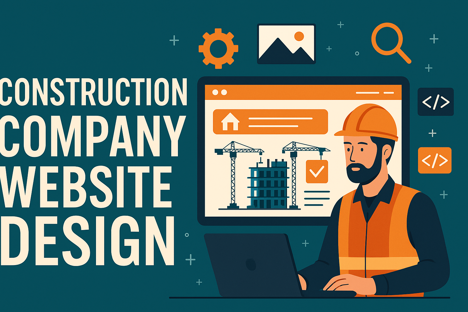
Startups often face the challenge of building an online presence quickly and effectively. One critical component of that presence is a well-designed landing page. A landing page is a focused, standalone web page created specifically to drive a single, targeted objective – such as capturing leads, promoting a product, or encouraging sign-ups. Landing page design services cater to this need by providing professional design and development of these high-impact pages. For startups in the USA (and beyond), leveraging WordPress for this purpose offers a powerful yet cost-effective solution to create engaging pages without reinventing the wheel.
In this comprehensive guide, we explore how landing page design services for startups can harness WordPress to craft conversion-focused pages. We’ll cover the fundamental design principles, practical tips (including HTML/CSS code snippets) for visual and interactive elements, and actionable SEO strategies to ensure your landing page not only looks great but also ranks well in search engines. Whether you’re a freelancer offering landing page design services to startup clients or a startup founder looking to understand the process, this article will provide a technical, professional roadmap for success.
Understanding Landing Page Design Services for Startups
A landing page design service is a professional offering focused on creating optimized landing pages tailored to specific marketing goals. Unlike multi-page websites or a full corporate site, a landing page is typically a single page with a singular focus. For startups, this focus might be building an email list before a product launch, showcasing a new app to gather user feedback, or driving sign-ups for a SaaS product free trial. What sets landing pages apart is their streamlined nature: minimal navigation, persuasive content, and a clear call-to-action (CTA).
Landing page design services for startups usually encompass a blend of marketing insight and design/development skills. The service provider (a freelancer or agency) will often:
- Consult on strategy: Understanding the startup’s target audience and goal (e.g., collect leads, make sales, get sign-ups) to shape the page’s messaging.
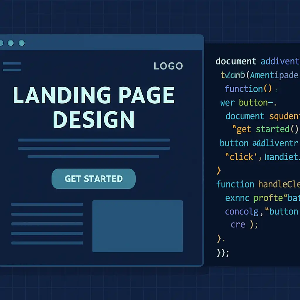
- Design the layout: Creating a wireframe or mockup of the page, ensuring that key elements like the headline, benefits, imagery, and CTA stand out.
- Develop the page: Implementing the design using web technologies or a platform like WordPress. This involves HTML/CSS for styling, and often integrations with other tools (analytics, email marketing, etc.).
- Optimize for conversions: Applying best practices (like placing the form or CTA prominently, using trust signals) and testing that the page is user-friendly on all devices.
- Integrate and launch: Connecting the landing page with the startup’s domain or website, and integrating any required services (for example, MailChimp for collecting emails or a CRM for leads).
- Analyze and iterate: After launch, monitoring performance (conversion rates, bounce rates) and making improvements if the landing page isn’t meeting its goals.
For a startup, engaging a professional landing page design services provider means you get a page built with conversion principles from the ground up. Instead of trying to patch together a DIY solution and risking a mediocre outcome, professionals bring experience in what works (and what doesn’t) for converting visitors into customers. This can save time and maximize the impact of the startup’s marketing campaigns.
Importantly, startups should ensure that whoever they partner with – whether an independent freelancer or a landing page design agency – has a clear understanding of the startup’s brand and goals. A landing page must align with the startup’s value proposition and speak directly to the intended audience. For example, a fintech startup’s landing page might emphasize security and trust with a clean, modern interface, whereas a creative mobile app might use bold visuals and catchy copy to engage a younger crowd. In both cases, the fundamentals of good landing page design apply, but the aesthetic and messaging will differ.
Landing Page Design Services for Startups
Build high-converting, responsive WordPress landing pages optimized for performance and SEO—ideal for fast, effective launches.
Request a Free Consultation 150+ projects delivered across landing pages, websites & SEO
This hypothetical snippet assumes a .features-section that contains two .features-column divs side by side (perhaps by default each column has width:50%). The media query (for screens 768px and below) sets them to block layout and full width, effectively stacking them.
- Ensure typography scales well. You might use slightly larger base font sizes for small screens to improve readability (since users hold phones further from their face than a monitor, sometimes a 16px text might feel small – 18px could be better). Many designs use responsive type sizing (CSS
@mediaqueries or relative units likeremthat can be adjusted globally). - Test all interactive elements on mobile. That includes any pop-ups, forms, or video players. For instance, if you have a video background, does it play nicely on mobile? (Often, mobile browsers disable autoplay videos to save data/battery, so ensure your design still looks okay if the video doesn’t auto-play, perhaps by providing a static image fallback.)
It’s wise to actually open your landing page on several devices (iPhone, Android phone, tablet) or use online tools to emulate them. Pay attention to load times on mobile data connections too – which ties into the next point.
Fast Load Times and Performance
Landing pages should be lean and fast. A slow page can kill your conversion rate: studies have shown that even a one-second delay in page load can result in a significant reduction in conversions. Users have little patience, especially when they’ve clicked an ad or come from a search expecting quick info. Moreover, page speed is a ranking factor in Google’s algorithm; slow pages may not rank as well, hurting your SEO efforts.
To ensure lightning-fast load times:
- Optimize images: As mentioned, compress images using tools or plugins (like Smush or ShortPixel). Serve them in modern formats like WebP when possible, which are smaller than JPEG/PNG. Use the appropriate dimensions – don’t load a 2000px wide image if it’s only displayed at 500px width.
- Minimize scripts: Each third-party script (analytics, heatmaps, widgets, etc.) can add loading time. Only include what’s necessary. For example, if you’re not using a particular WordPress plugin’s features on the landing page, disable it for that page (some plugins allow conditional loading).
- Use Caching and CDN: If your site is self-hosted, ensure you have a caching plugin enabled (like WP Rocket, W3 Total Cache, or WP Super Cache). Caching will let repeat visitors load the page much faster and reduce server load. A CDN (Content Delivery Network) can distribute your content to servers around the globe, making access faster for everyone (useful if your startup is targeting all of the USA or global audience).
- Clean up code: If you built the landing page with a drag-and-drop editor, sometimes they can include unnecessary code bloat. Wherever possible, streamline it. This might be as simple as removing any large background videos that aren’t crucial, or ensuring that your custom CSS is minified.
- Test with tools: Use Google PageSpeed Insights or GTmetrix to analyze your landing page. They will give specific recommendations (like “eliminate render-blocking resources” or “defer unused CSS”). Addressing these can often bump up your page speed scores and real-world performance.
A performant page not only keeps users engaged (low bounce rate) but also indirectly improves conversion. Think about it: if someone clicks your ad and the page takes 5 seconds to load, they might hit “back” before even seeing your great design. Strive for load times under 2-3 seconds on typical connections. Many well-optimized landing pages achieve load in under 1 second after initial HTML is fetched. It’s not always possible if you have heavy media, but every fraction of a second counts.
To summarize these key elements: a great landing page for a startup succinctly tells the visitor what is offered (headline), why it’s valuable (benefits), shows evidence that it works or is credible (social proof), and then strongly encourages action (CTA) – all in a clean, fast-loading, mobile-friendly package. If you cover those bases, you’re well on your way to a high-converting page.
WordPress Tools and Plugins for Landing Page Design
One of the advantages of using WordPress is the plethora of tools available to design and enhance landing pages. Whether you prefer a codeless, drag-and-drop approach or want to fine-tune everything with custom code, WordPress has you covered. Here we’ll explore a few routes you can take to create a landing page and the popular tools in each category.
Gutenberg Block Editor (Built-in) – Since WordPress 5.0, the block editor (codenamed Gutenberg) is the default page editor. It allows users to build layouts by stacking “blocks” (paragraphs, images, columns, buttons, etc.). For a simple landing page, the block editor might be all you need. WordPress even offers block patterns – pre-designed sections you can insert with one click (for example, hero sections, call-to-action sections, testimonials layouts, etc.). You can start a page by selecting a blank template (to remove headers/footers), then add a cover block (for a hero image with text overlay), heading blocks, paragraph blocks for your copy, image blocks, and button blocks. The block editor is quite capable, especially when combined with block library plugins that add more design blocks. Its advantage is that it’s built-in (no extra cost or plugins) and keeps your page lightweight. However, it may have some limitations for very intricate designs or advanced interactive elements.
Drag-and-Drop Page Builders – For more design flexibility, many professionals turn to page builder plugins. These provide a visual editor where you can drag elements onto a canvas and position them, often with a lot of style options. They usually come with a rich set of templates specifically made for landing pages, which can drastically speed up the design process. A few notable ones:
- Elementor – A hugely popular page builder plugin with a powerful free version. It lets you design complex layouts with ease, and offers widgets for forms, sliders, icons, etc. Elementor has a template library with many landing page designs to choose from. (There’s even a separate “Elementor Canvas” template that gives you a blank page to design on.)
- Divi Builder – Available as part of the Divi theme or a standalone plugin, Divi is a robust builder known for its design flexibility. It comes with hundreds of pre-built layouts and a strong community. Divi includes an A/B testing feature (called “Split Test”) which is great for optimizing landing pages by testing variations.
- Beaver Builder – A developer-friendly page builder that is praised for clean code output and stability. It might not have as flashy a template selection as Elementor or Divi, but it’s reliable and produces fast pages. Beaver Builder is often used by agencies for its no-frills, no-lock-in approach.
- Thrive Architect – Part of the Thrive Suite, this builder is focused on conversion elements. It includes design elements like countdown timers, lead forms, and integrates with other Thrive tools for A/B testing and quiz building. It’s a go-to for marketing-focused landing pages, though it requires a paid license.
Using a page builder does introduce some overhead (they load additional CSS/JS to function), but they offer unparalleled convenience. If you’re a freelancer, using these tools can cut down development time significantly, allowing you to deliver landing page design services efficiently. Just be mindful of performance – sometimes you might need to optimize or disable features you don’t use.
Dedicated Landing Page Plugins – These are a subset of page builders specifically marketed for landing pages and marketing funnels. A prime example is SeedProd, which is focused on creating landing pages, coming soon pages, and maintenance pages. It provides a ton of conversion-oriented blocks and templates. Another is OptimizePress, which bundles in not just page design but also marketing tools for list-building. These plugins often emphasize integrations with email marketing providers, webinar platforms, etc., because they assume marketing folks will use them heavily. They can be excellent if you’re building multiple landing pages and want a guided experience with proven templates.
Themes and Templates – Instead of (or in addition to) plugins, you might choose a WordPress theme that’s optimized for landing pages. Some lightweight themes like Astra or GeneratePress offer starter templates, a few of which might be landing-page style layouts. There are also one-page WordPress themes designed to function as a landing page out of the box. The theme approach can be limiting if you need drastically different landing pages (since a theme sets a general style for the whole site), but it’s worth noting for completeness. Often, freelancers will use a flexible theme (or code frameworks like Oxygen) as a base and create custom landing page templates on top of it.
Other Useful Plugins – Beyond the design itself, you’ll likely use a few supporting plugins on your landing page:
- Form Plugins: If your page requires a form (newsletter signup, contact form, registration), plugins like WPForms, Gravity Forms, or Contact Form 7 can handle that. They allow you to embed forms via blocks or shortcodes, and connect to email services or CRMs.
- SEO Plugin: As we’ll touch on in the SEO section, a plugin like Yoast SEO or Rank Math helps you set the meta title, description, and social media preview image for your page, and ensure the page isn’t accidentally noindexed.
- Analytics: It’s critical to measure how your landing page performs. Adding Google Analytics (or an alternative like Plausible or Fathom for privacy-focused analytics) will let you track visits and conversions. You can use plugins or add a simple script in the page header. Some landing page builders have built-in integrations for tracking conversion goals as well.
- Performance Plugins: Caching plugins (WP Rocket, etc.) or image optimization plugins can ensure your landing page loads quickly, as discussed earlier.
To better understand the landscape of popular tools, the table below compares a few major WordPress landing page design tools and their features:
DIY vs. Professional Landing Page Design Services
Startups have to decide whether to build landing pages in-house/DIY or to hire professionals (either a freelancer or a landing page design agency). Each approach has its pros and cons.
DIY Approach (Do It Yourself): Thanks to the tools we just discussed, it’s entirely possible for a founder or a small startup team to create a decent landing page without writing code. This route is appealing if you have a very limited budget or need to iterate quickly. You can grab a template, swap in your content, and launch. The benefits of DIY include cost savings and speed for minor changes (since you don’t have to wait on a third party). However, the DIY method requires an eye for design and conversion principles – a page can technically “work” but still perform poorly if it’s not well-crafted. There’s also a learning curve for tools like Elementor or SeedProd if you’ve never used them. If you go DIY, it’s worth investing some time in learning basic design dos and don’ts, or even consulting free resources on landing page best practices (to avoid common pitfalls like cluttered design or unclear messaging).
Hiring a Freelancer vs Agency: If you choose to enlist professional help, you have options. A freelancer who specializes in landing pages (especially WordPress-based) can be a cost-effective choice. Freelancers often offer personalized attention, working closely with you to understand your startup’s brand and goals. They can often turn around projects quickly and flexibly. On the other hand, a landing page design agency might bring a team to the table – perhaps a copywriter, a designer, and a developer collaborating. Agencies might be more equipped for larger campaigns or if you need multiple landing pages and broader marketing strategy input. The trade-off is usually cost; agencies tend to charge more to cover their overhead, whereas freelancers have less overhead and can price more competitively.
In terms of cost, the range can vary widely. A simple WordPress landing page from a freelancer might be a few hundred dollars, whereas a top-tier agency might charge thousands for a fully custom design with deep analytics integration. (One industry estimate puts a professionally designed landing page anywhere from $500 to $2,500+ depending on complexity.) Startups should weigh the importance of the landing page in their overall strategy: if this page is tied to a major product launch or a significant ad spend, investing in professional help can pay for itself through better conversion rates.
When evaluating pros to hire, consider:
- Portfolio and Experience: Have they built landing pages for similar industries or use cases? Check the quality and also performance if data is available (e.g., “helped X startup increase signups by 20%”).
- WordPress Expertise: Ensure they are comfortable in WordPress, including the specific tools you use or prefer (if your site is already on Divi, for example, a freelancer experienced with Divi is a plus).
- Understanding of Marketing: A great design is not just about looks – the person or team should understand conversion-centered design. Sometimes copywriting is half the battle, so if you lack strong copy, see if the freelancer/agency can assist with that too or if you need to provide it.
- Timeline and Communication: Professionals should give you a clear timeline for initial draft, revisions, and final launch. Rapid communication is valuable especially if you’re iterating based on campaign feedback.
A quick note on service landing page design: if your startup is offering a service (whether it’s B2B consulting, a SaaS solution, or anything intangible), designing that landing page might require a slightly different emphasis than a product page. Professionals who specialize in service landing page design will focus on building trust and clarity – for instance, explaining the service process, showcasing client testimonials or case studies, and highlighting the specific outcomes clients get. This is where an experienced freelancer or agency can really add value, by tailoring the landing page to fit the nature of the offering.
In summary, DIY can work for early-stage or low-stakes needs, but using landing page design services (freelance or agency) brings expertise that can boost conversion rates. Many startups find a middle ground: they might use an internal draft (via a template) to clarify their ideas, then bring in a professional to polish and optimize it. Whichever path you choose, keep the core principles in mind (the ones we covered above in design) so that the end result remains focused on conversion.
SEO Best Practices for WordPress Landing Pages
Design and content are one side of the coin for a successful landing page; the other side is making sure people can find the page. While many landing pages are used in paid ad campaigns (where traffic is driven from ads or email), you shouldn’t neglect organic search optimization. If someone searches for a solution that your startup provides, a well-optimized landing page could be the first thing they discover. Here are important SEO considerations for landing pages on WordPress:
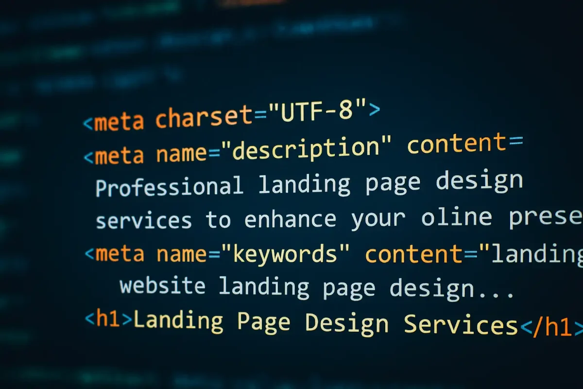
- Keyword Research & Usage: Identify the primary keywords relevant to your page. For example, if you offer marketing automation software for startups, a keyword might be “startup marketing automation tool”. Use the main keyword in the page’s title tag, in the headline if possible, and naturally throughout the body text. But avoid keyword stuffing – the content still needs to read well for humans. Often, a landing page has minimal text by design, so you may need to cleverly work in keywords in the few places you do have text (headings, subheadings, image alt text, etc.). Consider adding a brief FAQ section or additional info at the bottom of the page to capture long-tail search queries (many sites do this to get some extra indexable content onto an otherwise sparse page, all while keeping the main pitch up top concise).
- Title Tag & Meta Description: In WordPress, using an SEO plugin, set a compelling title tag for the landing page (this is what shows up as the clickable headline in Google results). It should be under ~60 characters and include your primary keyword and a hint of your value prop. For example: “AI Marketing Analytics for Startups – [Product Name]”. The meta description (about 155 characters) should further entice the click by summarizing the page’s offering and including a call-to-action or benefit if possible (e.g., “Automate your marketing reports and boost ROI. Try [Product] free for 14 days.”). While meta descriptions don’t directly influence ranking, they heavily influence click-through rate from search results, which is important.
- Clean URL Structure: Keep the URL of the landing page short and relevant. For instance,
yourstartup.com/landing-page-design-serviceoryourstartup.com/automate-marketingrather than a long string of parameters or a generic ID. WordPress by default uses the page title as the slug, which is usually fine. You can edit the slug to make it shorter if needed. A concise URL with keywords can slightly help SEO and definitely looks more trustworthy to users sharing or seeing the link. - Mobile-Friendly and Fast: As emphasized earlier, Google uses mobile-first indexing. This means the search engine primarily evaluates the mobile version of your page when determining rankings. If your landing page isn’t mobile-optimized, its SEO performance will suffer. Moreover, page speed is a ranking factor: slower pages may rank lower. Ensure your site passes Google’s Core Web Vitals (especially LCP – Largest Contentful Paint – which often relates to how fast your hero section shows up). Use responsive design (which you likely will if you followed our design advice) and test the page in Google’s mobile-friendly test tool or PageSpeed Insights.
- Image Alt Text and Metadata: Any images on the landing page (especially the important ones like the hero image or product screenshots) should have descriptive alt text. Alt text helps visually impaired users using screen readers and also gives search engines context about the image content. For example,
<img src="dashboard.png" alt="Screenshot of analytics dashboard showing ROI stats">. This not only is good for accessibility but could help your page appear in image search results for relevant queries. Additionally, set a proper Open Graph image (through an SEO plugin or manually) for the page so that when it’s shared on social media, it displays a nice preview image and snippet. - Avoid Indexing Unnecessary Pages: If you use a WordPress landing page plugin that generates landing pages outside the normal pages list (some do, for example they might use custom post types), ensure that the page you want indexed is indeed open to search engines (not tagged with noindex). Conversely, if you have duplicate versions (like a cloned page for A/B test or a “thank you” page after form submission), you might want to noindex those to avoid duplicate content issues or thin content pages being indexed. An SEO plugin lets you toggle indexation per page.
- Schema Markup: Consider adding structured data if applicable. A common one is FAQ schema (if you have a FAQ section on the landing page, you can wrap it in JSON-LD schema so that Q&A might show up directly in Google results as rich snippets). Some SEO plugins or add-ons can help insert FAQ schema with a simple UI. Another schema type might be Product schema if you’re directly selling a product on that page, or SoftwareApplication if it’s a SaaS signup page – this can enhance how your listing appears in search with ratings or other info, though it’s a bit more involved and might need developer help.
- Internal Linking: Make sure your landing page is linked from your main website (unless it’s intentionally a standalone page for a very separate campaign). For instance, you might link to it from your homepage or relevant blog posts. Internal links help search engines find the page and also pass some “link juice” (ranking power) to it. Use the target keyword as anchor text in a natural way (e.g., a blog post might say “we offer landing page design services for startups” and link to your landing page service page). Similarly, you might include a few contextual outbound links on the landing page if appropriate (for example, link to your blog or a resource). Pure landing pages often avoid any external links to keep users focused, but from an SEO perspective having at least one or two links out to high-quality relevant resources can be positive – it shows context and that you’re not a dead-end on the web.
- Content Freshness and Updates: Landing pages can rank for a long time, especially if they continue to be relevant. Update the content periodically to keep it fresh – not necessarily changing your core message, but perhaps updating a statistic in your copy, adding a new testimonial, or refreshing the design in a minor way. When Google sees a page is updated (and if those updates correlate with improved engagement), it can maintain or improve your rankings over stagnant competitors. Also, ensure comments are off (or moderated) on your landing page if it’s a WordPress page – you don’t want spam comments appearing (some themes leave comments on for pages inadvertently; you can disable that in the page discussion settings).
- Backlink Building: While not an on-page factor, it’s worth noting that if you want your landing page to rank well, getting quality backlinks to it is important. This might involve sharing the page with partners, listing it in startup directories, or using it in guest post bios, etc. WordPress doesn’t magically get you backlinks, but the fact that your page is on WordPress means you have easy tools to edit and optimize the content as you gain more insight (for example, if you notice certain keywords driving traffic, you can refine the page to target them better).
In essence, treat your landing page like any important page on your site when it comes to SEO: give it a solid foundation of keyword-optimized content, ensure the technical aspects (speed, mobile, metadata) are covered, and then promote it as part of your overall content strategy. This way, it can continue to bring in leads through organic traffic in addition to whatever paid campaigns or referrals you use.
Ongoing Optimization and A/B Testing
Building the landing page is just the beginning. The best campaigns are those that continuously improve their landing pages through data-driven optimization. Once your page is live and collecting traffic (be it from organic search, ads, or social media), you should be monitoring how it performs and looking for opportunities to increase that conversion rate.
Track Key Metrics: At minimum, track conversions (form submissions, button clicks, etc.), page views, bounce rate, and time on page using a tool like Google Analytics (GA4) or another analytics platform. If your goal is lead generation, set up a conversion event for when someone fills out the form or clicks the CTA button. These metrics will tell you how the page is doing. For instance, a high bounce rate might indicate that visitors aren’t finding what they expected or something is putting them off. A low conversion count with lots of traffic means you’re getting eyes on the page, but the page might need tweaks to persuade more people.
Use Heatmaps or Session Recordings: Tools like Hotjar or Crazy Egg can show you where people click and how far they scroll. You might discover, for example, that most people never scroll below the fold – which means your top section really has to pull its weight, or that something at the very top is causing disinterest. Or perhaps you see people clicking on a word or image that isn’t actually a link – maybe indicating they’re looking for more info that you didn’t make obviously clickable. These insights are gold for refining your design.
A/B Testing Changes: Rather than guessing, use A/B tests (also called split tests) to try out improvements. With WordPress, you can use plugins or external tools to run A/B tests. Some page builders (like Divi and Thrive, as noted) have built-in testing capabilities. If not, there are plugins like Nelio A/B Testing, or you can use Google Optimize (though as of 2023 Google Optimize is being phased out, so you might need an alternative). Pick one element at a time to test: for example, test two different headlines (version A vs version B) and see which yields a higher conversion rate. Or test the color of the CTA button, or the placement of a testimonial section. Over time, these incremental tests can lead to significant gains. One caution: make sure you have enough traffic to get statistically meaningful results – if your page only gets 50 visits a month, A/B testing might not reach a clear conclusion. In such cases, you might rely more on qualitative feedback or just applying known best practices.
Analyze and Iterate: Conversion optimization is an iterative process. Perhaps your first version of the page converts 5% of visitors, and through some design tweaks and copy changes you hit 8%. Rather than settling there, think of what else could be optimized – maybe try adding a short explainer video to see if that boosts understanding, or experiment with a different form length. Also, take into account any changes in your audience or traffic sources. If you start getting more mobile traffic, maybe an element that worked on desktop needs a different approach for mobile visitors.
Listening to User Feedback: If possible, gather feedback from users. This could be direct (talk to a few people who signed up about what convinced them or what almost stopped them) or indirect (add an optional field “How did you hear about us?” or “What made you sign up today?” on the form). Sometimes the words users use can be turned into powerful copy on the page. For example, if many users say “I signed up because it was the only tool that looked simple enough,” then emphasizing simplicity in your headline or hero text could attract even more like-minded visitors.
Keep an Eye on SEO Performance: Use Google Search Console to monitor how your landing page is performing in search results – which queries it’s showing up for, click-through rates, etc. You might find new keywords to incorporate or detect if a change you made accidentally hurt your rankings (for instance, if you removed a section that unknowingly contained a keyword Google liked).
Finally, be patient and methodical. It’s easy to get a bit obsessed with tweaking (and indeed, passion for improvement is good) but always try to rely on evidence. Change one major thing at a time and see what the impact is. Over time, you’ll dial in a landing page that significantly outperforms your starting version. And when that happens, you have a real asset – a high-converting page you can drive traffic to confidently, knowing a good percentage will turn into leads or customers.
Now that we’ve covered everything from design to optimization, let’s address some common questions related to landing page design services and WordPress: